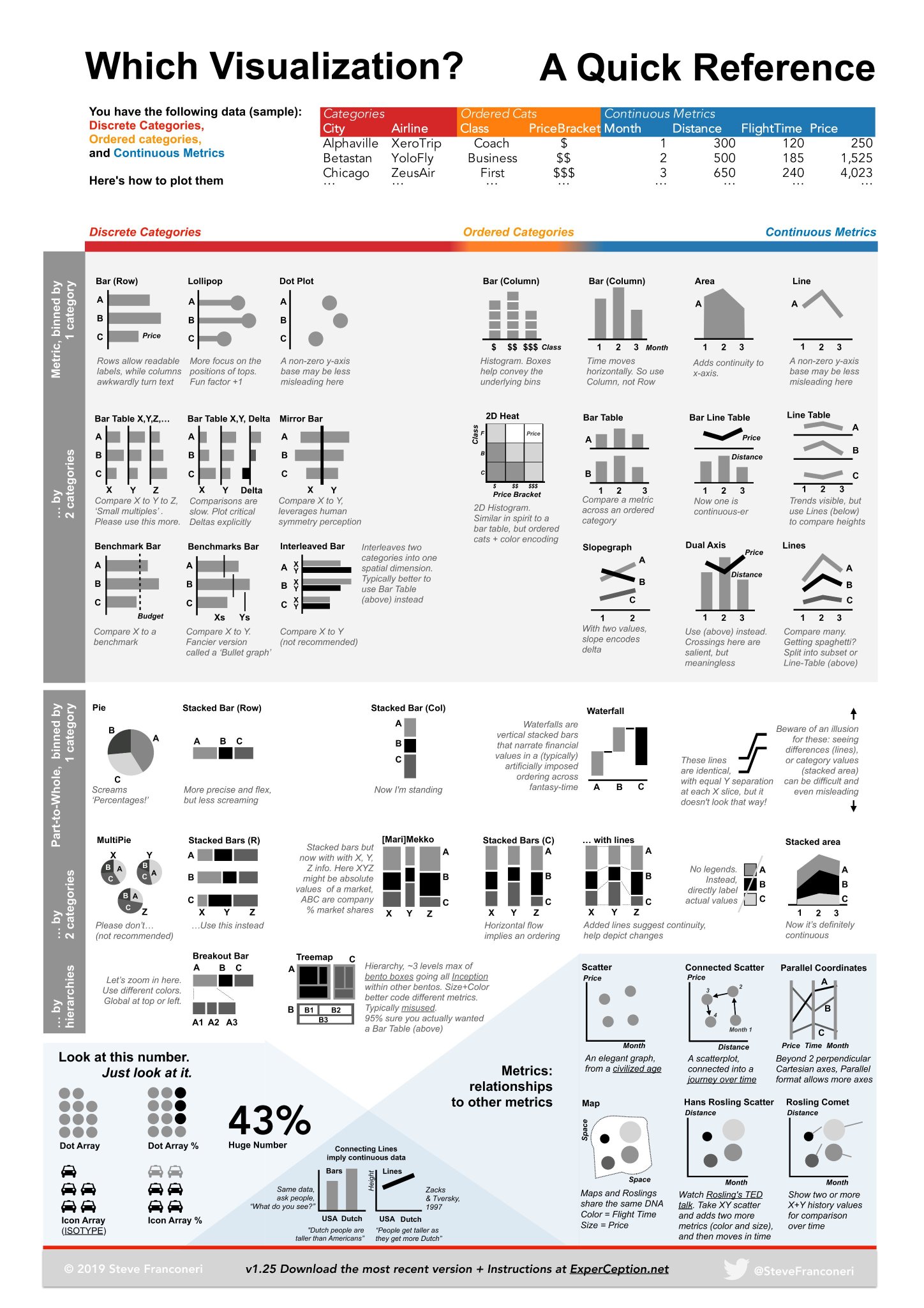
Which Visualization to Use: A Quick Guide
Which Visualization? A Quick Reference

Visualizing Data Types
Sample Data Columns
- Categories: City, Airline
- Examples: Alphaville, Betastan, XeroTrip, YoloFly
- Ordered Categories: Class, PriceBracket
- Examples: Coach, Business, First, $$, $$$
- Continuous Metrics: Month, Distance, FlightTime, Price
- Examples: 1, 300, 120, 250
How to Visualize Them
Discrete Categories
-
Bar (Row)
- Rows allow readable names, while columns get awkwardly short.
- Example: A, B, C
-
Lollipop
- More focus on the position of tops.
- Easier than Bar for X ≠ Y.
- Example: A, B, C
-
Dot Plot
- A non-zero y-axis helps readability, less misleading here.
- Example: A, B, C
-
Bar Table X, Y, Z...
- Compare X to Y to Z.
- Small multiples useful, but please use this more.
- Example: A, B, C; X', Y', Z'
-
Bar Table X, Y & Delta
- Comparisons are slow; Plot critical pieces statistically.
- Example: A, B, C; Xs, Ys, ΔX, ΔY
-
Mirror Bar
- Compare X to Y leveraging human symmetry perception.
- Example: A, B, C; X', Y'
-
Benchmark Bar
- Compare X to a benchmark.
- Better than deviations.
- Example: A, B, C; X', Benchmark'
-
Benchmarks Bar
- Compare X to N.
- Former version is called a 'Bullet graph.'
- Example: A, B, C; Xs, N
-
Interleaved Bar
- Interleaves two categories into one spatial dimension.
- Example: A, B, C; X', X''
-
Pie Chart
- Screams 'Percentages'.
- Example: A, B, C
-
Stacked Bar (Row)
- More precise and flexible but less screaming.
- Example: A, B, C
-
Multipie
- Compare segments across multiple pies.
- Better avoided—confusing.
- Example: A, B, C, X', Y', ΔX, ΔY
-
Breakout Bar
- Breaks down categories into multiple levels.
- Example: A, B, C
Ordered Categories
-
Bar (Column)
- Histogram-like visualization.
- Shows order and focus on class comparison.
- Example: $$, $$$, Class'
-
Bar (Column)
- Time moves horizontally; add time continuity.
- Example: Month 1, 2, 3
-
Area
- Adds continuity to the x-axis.
- Example: A, B
-
Line
- A non-zero y-axis helps readability, less misleading.
- Example: A, B, C
-
2D Heat
- Similar structure to a bar table.
- Shows ordered elements with color encoding.
- Example: X', Z'
Continuous Metrics
-
Bar Table
- Compare a metric across an ordered category.
- Example: Metric X', Y', Z'
-
Bar Line Table
- Shows a continuous x.
- Example: A', X', Y', Z'
-
Line Table
- Shows trends using lines to compare heights.
- Example: A', X', Y', Z'
-
Slopegraph
- With two values, slope encodes difference within.
- Example: X', Y', Metric'
-
Dual Axis
- Uses two axes with meaningful crossing points.
- Example: A', Metric', Price'
-
Scatter Plot
- Compares relationships elegantly between 2 metrics.
- Example: Metric', Scatter'
-
Connected Scatter
- Shows connected journey over time in trend form.
- Example: Month', Metric', Price'
-
Parallel Coordinates
- Time trends shown perpendicular sequentially.
- Example: Metric', Time'
Part-To-Whole & Metrics to Other Metrics
-
Stacked Bar (Row)
- Vertical stacked categories.
- Example: A', B', C'
-
Stacked Bar (Column)
- Horizontal stacked waterfall bars.
- Shows change over time.
- Example: A', B', C', Month'
-
Stacked Bar (C)
- Combines categories horizontally.
- Example: X', Y', Z', A', B'
-
Treemap
- Hierarchical representation of metrics and relationships.
- Example: A', X', Y', Subcategories
-
Icon Array
- Visual representation percentage.
- Example: %
-
Connecting Lines
- Lines compare US Dollar trends over time.
- Example: Metric', Price'
-
Horizontal Scatter Line
- Data points show the impact over time or conditions.
- Example: Month, Metric'
-
Map
- Comparative view: colors or size based on regions.
- Example: Map Regions'
Essential Points
-
Number Representation
- Example: 43% Huge Number
-
Connection Points
- Essential for the role of connections within datasets example.
- Example: USD points from various year comparisons.
By understanding this chart, you can know which type of visualization to use depending on the data type you have and the message you intend to communicate.
Reference:
www.datylon.com
80 types of charts & graphs for data visualization (with examples)
www.atlassian.com
Essential Chart Types for Data Visualization | Atlassian
blog.hubspot.com
18 Best Types of Charts and Graphs for Data Visualization [+ Guide]