2020 General Election Map Analysis and Insights
Analysis of the 2020 General Election Map

Overview
- Title: "Land doesn't vote. People do."
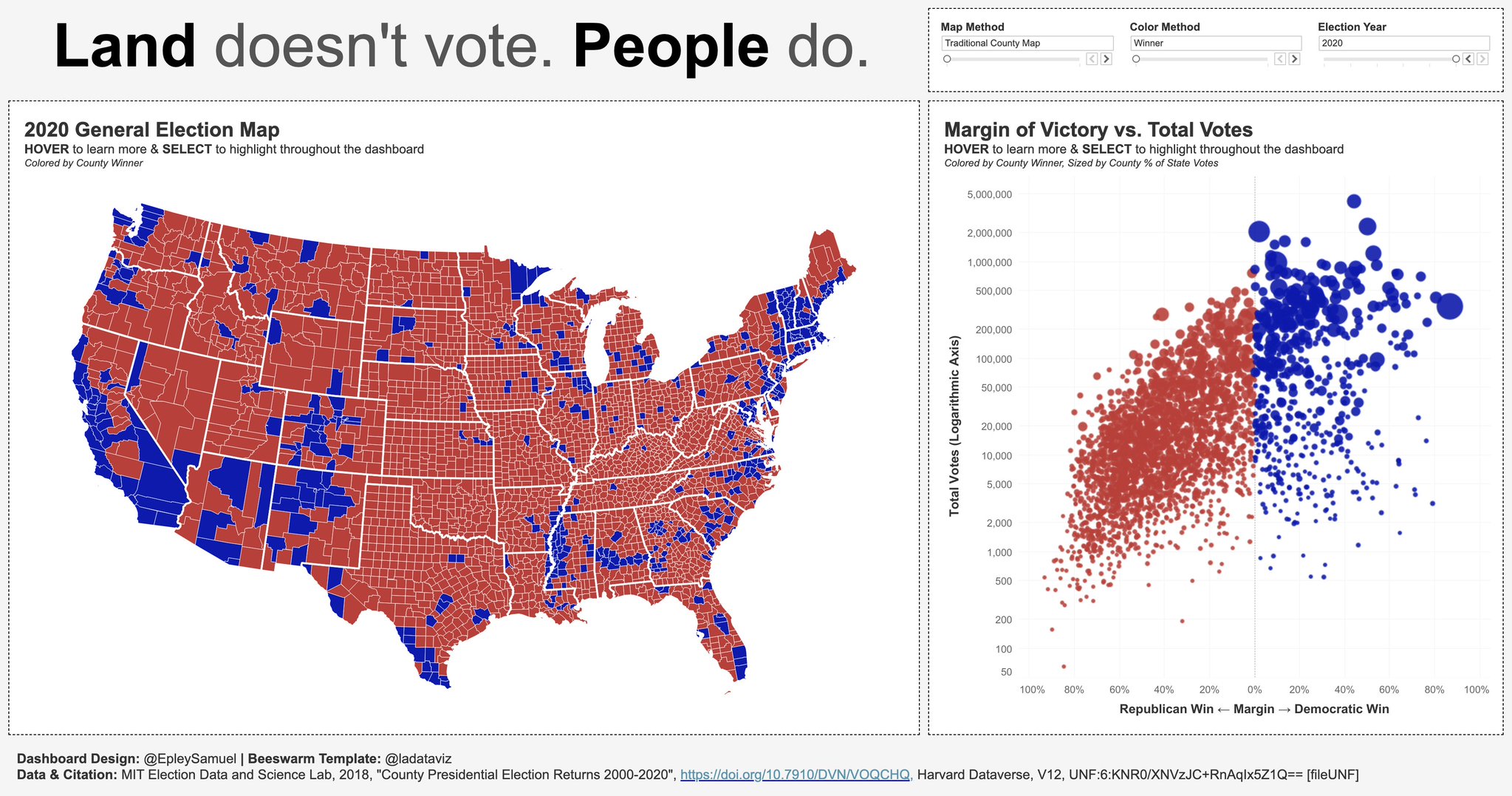
- Main Focus: The image presents a dashboard with a map of the 2020 General Election results across counties in the United States and a scatterplot showing the margin of victory versus total votes.
- Data Source: MIT Election Data and Science Lab, 2018, "County Presidential Election Returns 2000-2020".
Left Panel: 2020 General Election Map
- Map Visualization:
- Counties Displayed: Each county is colored based on the winning party (Red for Republicans, Blue for Democrats).
- Geographical Distribution:
- Western and Midwestern US predominantly red (Republican).
- Coasts and major urban centers predominantly blue (Democratic).
- Hover Functionality: Provides additional details about individual counties when hovered.
Insights from the Map:
- Urban vs. Rural Divide:
- Urban counties tend to lean Democratic (blue).
- Rural areas are more likely to be Republican (red).
- Significant Blue Pockets:
- In states like California, New York, and Illinois, majority of the counties are blue.
Right Panel: Margin of Victory vs. Total Votes
- Scatter Plot Representation:
- Axes:
- X-Axis: Margin (Republican Win on the left, Democratic Win on the right).
- Y-Axis: Total Votes (Logarithmic scale).
- Color Coding: Follows the same color scheme (Red for Republican wins and Blue for Democratic wins).
- Axes:
Insights from the Scatter Plot:
- Distribution:
- The distribution shows a clear partisan split.
- Large blue clusters indicate many votes in counties won by Democrats.
- Red clusters, though smaller in vote count, show a widespread win in terms of the number of counties.
- Logarithmic Axis for Total Votes:
- Helps in visualizing the wide range of vote counts across different counties.
Additional Information
- Functional Features:
- Map Method: Traditional County Map.
- Color Method: Winner.
- Election Year: 2020.
- Interactive Elements: Allows users to hover and select data points for detailed insights.
Final Thoughts:
- Electoral Trends:
- The visualization clearly emphasizes the disparity between land area and population density in election results.
- The statement, "Land doesn't vote. People do.", highlights that populous areas significantly influence election outcomes.
- Usefulness:
- Such visualizations are crucial for understanding the geographical and demographic factors in electoral politics.
- They can guide both political strategists and scholars in their analysis and planning.
Reference:
www.reddit.com
Land doesn't vote. People do. : r/gifs - Reddit
www.quora.com
If there are a lot more red counties than blue counties, then ... - Quora
www.quora.com
Does your vote matter if you live in a state with a strong ... - Quora