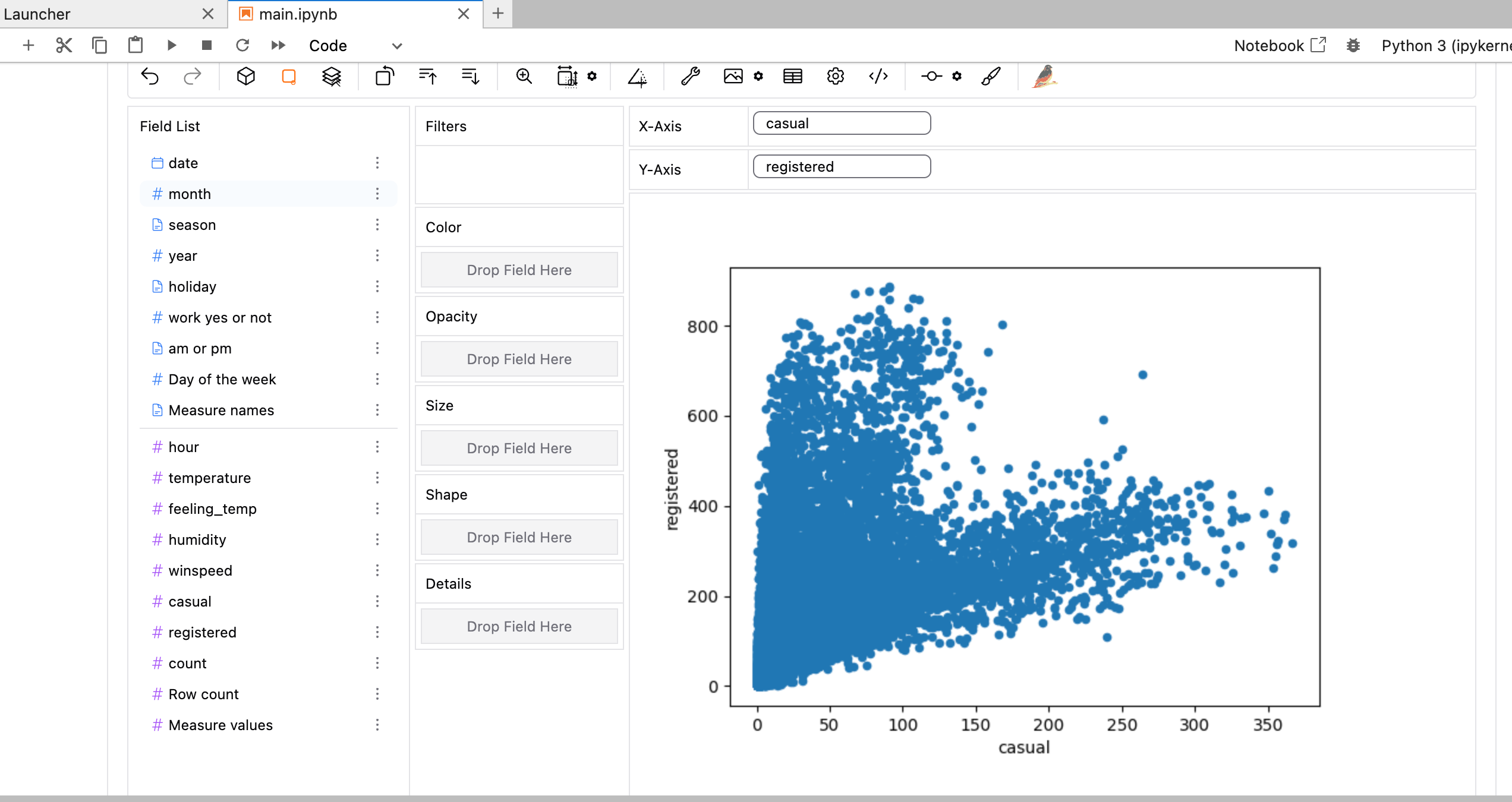
Scatter Plot Analysis of Casual vs. Registered Users
Scatter Plot Analysis

-
Axes Description:
- X-Axis: Represents the number of "casual" users.
- Thoughts: Understanding casual users can provide insights into user behavior. The more casual users there are, the potential for high engagement should be explored.
- Y-Axis: Represents the number of "registered" users.
- Thoughts: A higher number of registered users is often seen as beneficial for any platform. Analyzing the relationship between casual and registered users can help in strategizing user retention and conversion.
- X-Axis: Represents the number of "casual" users.
-
Data Visualization:
- The scatter plot shows data points clustering in a lower region, indicating that there are fewer registered users when casual users are low.
- Additional Information: This clustering suggests that user engagement may increase as the number of casual users rises. Strategies may need to focus on converting casual users to registered users.
- The scatter plot shows data points clustering in a lower region, indicating that there are fewer registered users when casual users are low.
-
Trends Observed:
- There appears to be a pattern where an increase in casual users may correlate with an increase in registered users, but the growth in registered users slows down at high numbers of casual users.
- Ideas: This indicates a saturation point; understanding why this occurs could uncover new marketing or retention strategies.
- There appears to be a pattern where an increase in casual users may correlate with an increase in registered users, but the growth in registered users slows down at high numbers of casual users.
-
Field List: The available fields for further data analysis include:
Field Name Description date Date of the data point month Month of the data point season Season during which the data was collected year Year of the data point holiday Whether the date was a holiday work yes or not Indicates if it was a workday am or pm Time of day Day of the week Specific day of the week hour Hour of the day temperature Temperature during the day feeling_temp Perceived temperature humidity Humidity level winspeed Wind speed data casual Casual user count registered Registered user count count Total counts Row count Count of rows Measure values Values for measures -
Potential Analysis Opportunities:
- Consider conducting further analysis on the fields listed to unearth deeper insights into user behaviors and engagement patterns. Analyzing seasonal effects or time of day may reveal critical patterns that affect user registration and casual usage.
Reference:
www.atlassian.com
Mastering Scatter Plots: Visualize Data Correlations - Atlassian
www.abtaba.com
Scatterplot In ABA: Definition & Examples
medium.com
Bike-Sharing Dataset Analysis in Python | by Anitamontoyamm